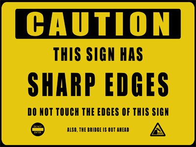
The American Society of Safety Professionals released an article on May 24th, 2019, discussing the importance of signage in the workplace. The article lists three main ways signs improve safety at work (universal safety language, location of signs, and avoiding mixed messages), but fails to discuss differences in workplaces and how to address them.
The first point made is on language and attributes of signage that are both regulated as well as suggested including: the ANSI regulation that describes attributes such as color and size, demographics of the workplace, and education levels of those who are being alerted by the sign.

Second, the location of signs is discussed. The article mentions that signage needs to be far enough away from a hazard so that employees have adequate time to assess the situation but still close enough that the sign makes sense.
Finally, ensuring that there is consistency in signage helps to guarantee the success of the sign. Workplaces with excessive signage are likely not to be any safer than one with lesser, but more relevant, signage. Overloading on messages can confuse workers or even make them disregard all signs in general, which would be a detriment to safety.
Questions to ask yourself before posting a sign are “is this sign needed?” “is this sign similar to another already posted?” “Does this sign contradict one already posted?” “Have our policies changed?” “Will everyone understand what this means?”. If any of these questions are answered negatively, then they need to be re-thought before being implemented.
All this being said, a huge part of whether or not a sign is appropriate depends on where you work. Office buildings aren’t going to require highlighter-orange signs to express that the coffee makers are hot, or that the elevator is down; meanwhile, a manufacturing plant is going to want to express dangers in every way possible, from bright colors to bold fonts and even multiple languages to ensure that all members of staff will understand the danger.
Safety and notice in the workplace are definitely an important part of every day life, but the main takeaway here is that context is key.
To see the original article go to Three Ways Signage can Improve Work Safety
Author: Ali Brehm


